Pantone vs Pantone Bridge Colors
Now that you know the benefits and drawbacks of Flexographic and Digital printing from our previous blog, we want to dive a little bit deeper into Pantone colors vs Pantone Bridge Colors.
Flexographic and Digital printing use two different types of Pantone colors. The image below shows Pantone colors vs Pantone Bridge colors. The book that is on the left is the Pantone Bridge color book which is meant to match digital printing colors. It shows two color boxes; the first box is the solid RGB color used for digital printing and is only giving the color percentages based on a digital CMYK color pallet.
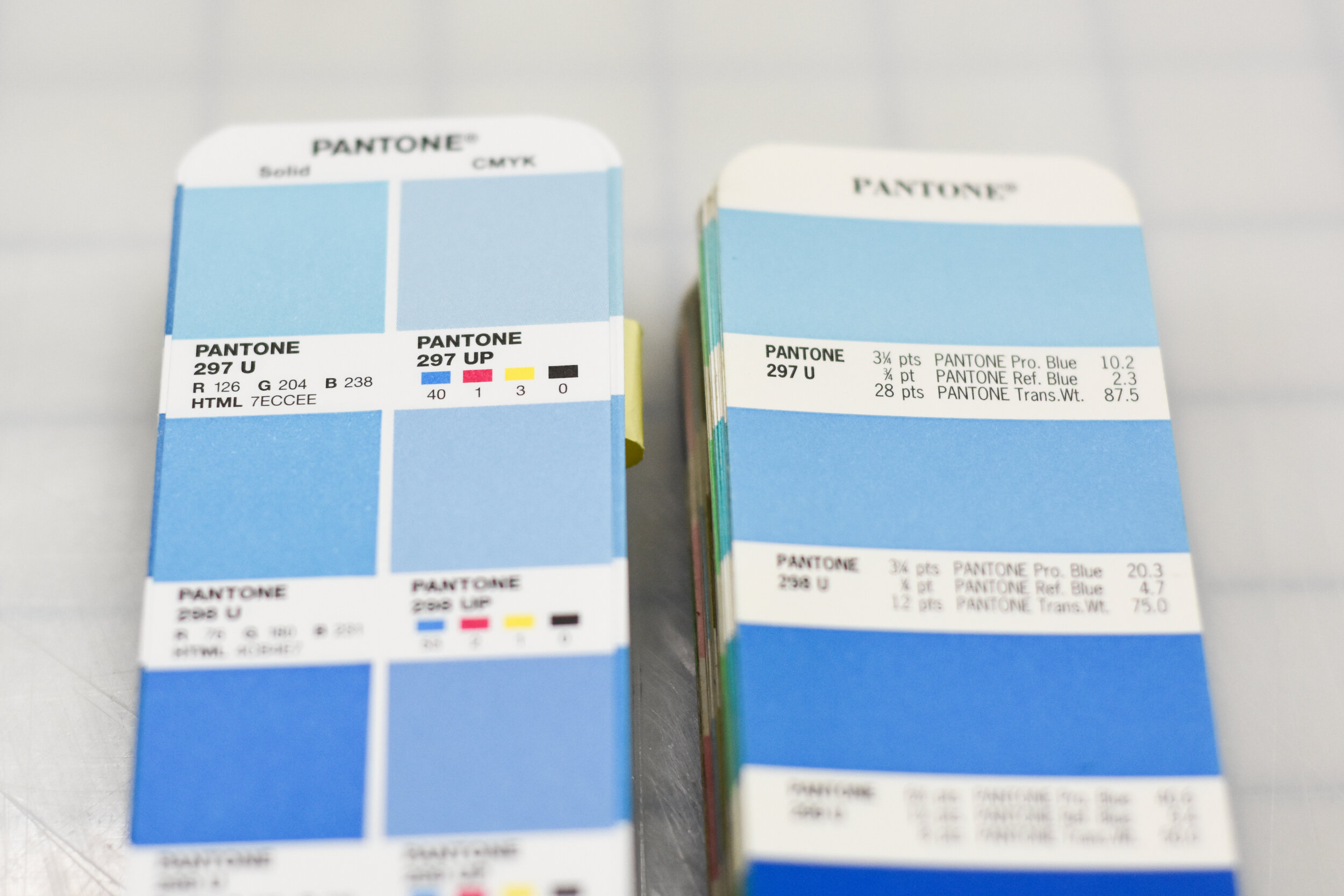
The second box gives the percentages for how much CMYK (4 color process) that is needed to obtain the correct Pantone color.
For example, we see:
R 126% C 40%
G 204% AND M 1%
B 238% Y 3%
K 0%
The book on the right is a Pantone color book for Flexographic printing. This book will break down the solid ink colors into the percentages that the press operator needs of each physical ink color that is eventually rolled on to the client’s substrate.
Example:
10.2 Process Blue
2.3 Reflex Blue
87.5 Trans White
The only way for a press operator to match a Pantone Bridge Color is to color match to something that is already printed (a previous label you’ve printed with us, or a sample of the color you’re looking for).
Our Flexo and Digital press operators are well versed in understanding Pantone and Pantone Bridge Colors to ensure our clients are getting the perfect labels.
If you have any questions about labels or need a quote, give us a call at (630) 443-9602.